Posts

Showing posts with the label void

Space and Placement: 2
Image
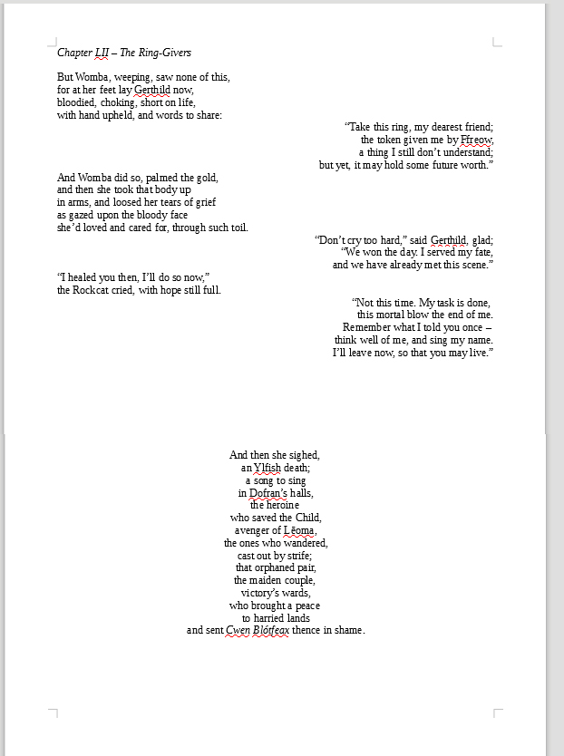
Looking back over some of the modernist poetry we studied in Semester 1's Humanities class, I've continued to apply more radical visual structures to the poetic text, using words and their placement as a means of enforcing certain feelings or concepts for the reader: for example, during an earlier scene where the main character struggles up the rocky path to her home at a pivotal moment, separating each word describing the journey onto a line, spaced out from the previous, and following, words to suggest a tricky series of steps (compounds and phrases such as 'rock-tripped', 'thorn-pricked', 'branch-beaten' enforcing the difficulty of the climb). And, in the climactic battle - the main emotional thrust of which is not the overall victory of the allies, or the defeat of the tyrant king and queen - but the loss of the main character's best friend, the effect of which reaches its pinnacle in the third page below, signifying almost unbearable isolation a...
The Spaces Between...Looking Into the Void

Image
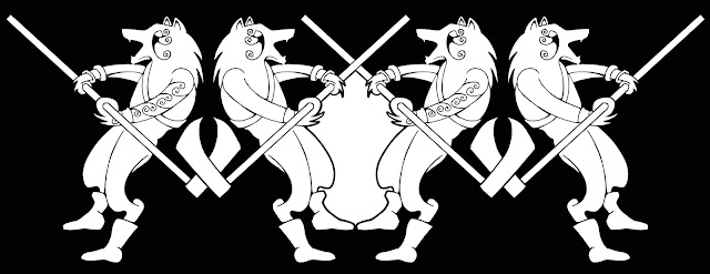
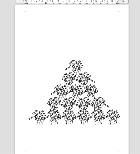
 Additional: After posting the above designs, I decided to play around with inverting and multiplying them in Photoshop and investigating the abstract spaces which opened up between the repeated images: This led into a mini-exploration of the Japanese concept of Ma (negative, empty space or void - a concept which I had explored previously in my 2020 Honours degree work) and created a few abstract forms as a result:   Some of these are still recognisable from their original forms - some are rather Rorschach-like. I'm not quite sure what use these might be to the overall exhibition or the book design, although it seemed to chime faintly with Derrida's deconstruction of binary oppositions (black/white, say) and therefore seemed to be a physical and literal 'bit between' those boundaries and extremes (black outlines creating forms on white paper) amd therefore somewhat linked to the notion that characters, races and nations in the text are not 'black and white' -...

Space and Placement

Image
 Today's tutorial went well, focusing mainly on space - both physical and visual, in the 'museum'/exhibition layout, and in the text itself, which is now in the final editing and presentation stage. We discussed the nature of traditional museums and how they tend to put the visitor through a planned timeline of experience - navigating different places and spaces - circular and/or linear. This came back to my sketchy idea of enforcing some kind of cyclical physicality upon the visitor to my space - bringing them back to the beginning (cf. the ouroborus snake design, again). Seeing strong examples of what can be done with art books and layout had influenced my thoughts on using more white space in the book/text (and reflecting this in the physical museum layout) - by adding blank pages, or creating extra spaces between lines and words at crucial points in the narrative, and interpolating the drawings of characters not as illustrations but as 'break points', for exampl...