Posts

Of Print and Publicity
Image
Whilst editing of the text continues (the early chapters, having been derived from a long-abandoned prose work, need special amounts of attention), I also spent some time editing some of the design pieces for submission to the Masters showcase for this year. I doubt very much any of them will be accepted, but they will come in handy for the online degree show, which will be a very different form of presentation to the physical space:  I also decided to check with the art school print shop their options for binding hardback books - the 'thesis' style which I initially deemed "not quite what I'm looking for" some months ago, but which now seems wholly appropriate - being the traditional form of binding for academic, authoritative texts, an assumed status which is offset by the interior text in all its ambiguity and ambivalence. The print team also offered a choice of gold or silver lettering/design for the covers, which I found very interesting. I've never liked
The Spaces Between...Looking Into the Void

Image
 Additional: After posting the above designs, I decided to play around with inverting and multiplying them in Photoshop and investigating the abstract spaces which opened up between the repeated images: This led into a mini-exploration of the Japanese concept of Ma (negative, empty space or void - a concept which I had explored previously in my 2020 Honours degree work) and created a few abstract forms as a result:   Some of these are still recognisable from their original forms - some are rather Rorschach-like. I'm not quite sure what use these might be to the overall exhibition or the book design, although it seemed to chime faintly with Derrida's deconstruction of binary oppositions (black/white, say) and therefore seemed to be a physical and literal 'bit between' those boundaries and extremes (black outlines creating forms on white paper) amd therefore somewhat linked to the notion that characters, races and nations in the text are not 'black and white' -

Creating Visual (Dis?)Harmony

Image
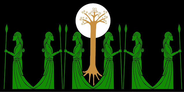
 A few days of essential family business later, and I was able to return to the question of space and placement of visual components in the text over the weekend. I've now inked up and digitized all of the original sketches and visual ideas I had for possible wood and stone carvings. Below are a few of them, some turned into border and banner designs, making nearly 20 in all (including cleaned-up versions of the designs used in the stone carvings).  What's quite nteresting is the lack of several notable characters or character-types - no humans are depicted (apart from Gerthild, who is a bit of a special case). This might have been simply due to my interest in figuring out, and representing, the unfamiliar - i.e., the genuine Others - who appear in the story: most readers could visualise what a wizard or a king might look like, but nobody has ever seen, until now, a depiction of a Rockcat or Ulfish person. Only 4 of the 6 (prime) deities have (so far) been drawn, although the

Space and Placement

Image
 Today's tutorial went well, focusing mainly on space - both physical and visual, in the 'museum'/exhibition layout, and in the text itself, which is now in the final editing and presentation stage. We discussed the nature of traditional museums and how they tend to put the visitor through a planned timeline of experience - navigating different places and spaces - circular and/or linear. This came back to my sketchy idea of enforcing some kind of cyclical physicality upon the visitor to my space - bringing them back to the beginning (cf. the ouroborus snake design, again). Seeing strong examples of what can be done with art books and layout had influenced my thoughts on using more white space in the book/text (and reflecting this in the physical museum layout) - by adding blank pages, or creating extra spaces between lines and words at crucial points in the narrative, and interpolating the drawings of characters not as illustrations but as 'break points', for exampl

Around and Around...

Image
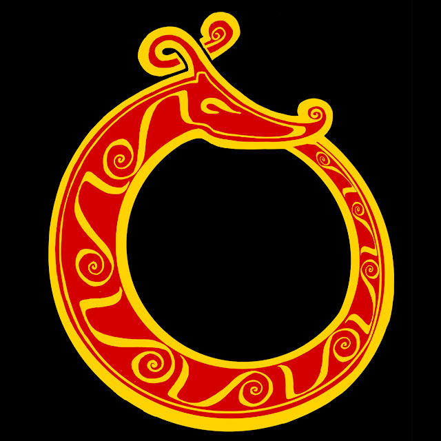
 The ouroboros - an ancient symbol of fertility, totality, eternity, being a serpent or dragon chewing its own tail. The design below is a 'cleaned up rough' of the first visualization I created for this project, last autumn, and grew out of a sketchbook scribble originally planned to be a collaboration with a metalworking student, aimed at producing a brooch or similar piece of physical jewelry design: With its horn or antler, the design also echoes the hybrid beasts of Celtic/Pictish design, and my own 'cosmic beast' which is supposed to embody attributes of all animals, being the progenitor of all species. The design is also intended to look in two directions at once, in something of an Escher-like visual paradox - the tail curving around in one plane to be held in the mouth, but also suggestive of moving away from the viewer and ending up behind the snake's head, hinted at by the distortion applied to the bodily decorations, and the fact the inner space is not

Deconstructing the Museum: Part 1

Image
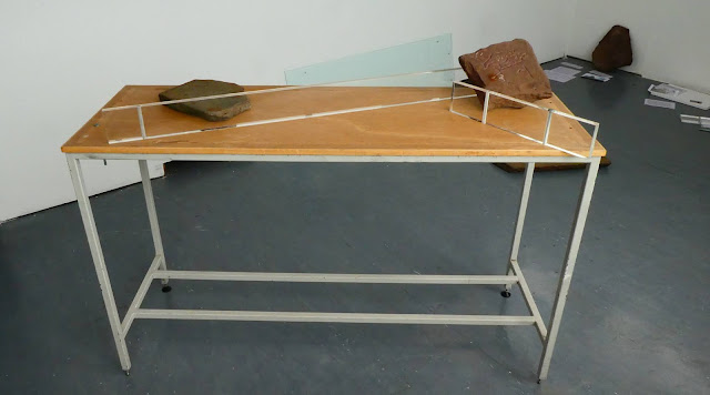
 A most excellent curatorial tutorial today pulled things in a totally unexpected - but possibly inevitible - direction, given the themes of deconstruction, subversion and metatextuality which have been at the forefront of things lately. It all started when we dismantled the glass display case to get some stones inside...and then we started moving things around... Currently it's all about utilising the space, and subverting the expectations of what a traditional museum ought to look like, even down to whether the explanatory texts ought to be placed alongside their corresponding exhibits - and in a sense also echoing early 20th Century criticism of Beowulf  (which Tolkien confronts in his famous essay The Monsters & the Critics ) that the 'marginal elements' (i.e the monster fights and the dragon) are given centre-stage (because, obviously, any 'serious' epic must not trouble the reader with such trivia - despite the plethora of sea-monsters, one-eyed giants and

Illuminating Design

Image
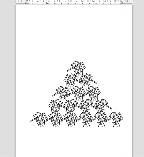
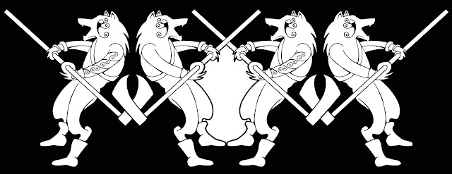
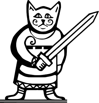
 Trying to figure out exactly how the finished, printed book will look with very little actual time remaining (I reckon I'll need at least 3 weeks to allow for the printers getting the job done and delivered, depending upon 'the situation' out there), so this evening I cleaned up a couple of the character designs into .eps image format so they can be resized to any scale. The 'marching band' of Ulfhednar border design and the Gifli character turned out quite nicely:  I'm not sure how much of this kind of thing I want to use - or how I could use it - as one of the plans at the outset was to produce visual work with physical and material qualities in order to get away from any form of 'illustration'. Besides, there's plenty of great artists out there who can do this kind of Celtic design work ten times better than me with beautiful knotwork and so on, but what I can bring to the visuals is a certain individuality, I reckon.  But I did always see the Ul