Of Print and Publicity
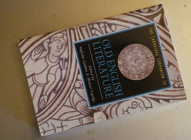
I also decided to check with the art school print shop their options for binding hardback books - the 'thesis' style which I initially deemed "not quite what I'm looking for" some months ago, but which now seems wholly appropriate - being the traditional form of binding for academic, authoritative texts, an assumed status which is offset by the interior text in all its ambiguity and ambivalence.
The print team also offered a choice of gold or silver lettering/design for the covers, which I found very interesting. I've never liked gold as a decorative metal and silver definitely reflects both the emphasis on lunar deities and cycles within the text, as well as a slightly non-conforming design aspect (all books I own with embossed lettering have the title text in gold, whether the binding boards are blue, black, brown or green). Take the dust jacket off an older hardback, and chances are the spine text will also be in gold. The privileging of the metal of the sun over the matriarchal moon is one with very ancient origins indeed. This still suggests the authoritative physical text (as in ancient times, e.g Anglo-Saxon England, the making of books was an expensive and time-consuming process - their contents, then, had to, by definition, be worthy of preservation) and even now, the more "expensive-looking" a book is, the more reliable - and worthy - its contents assumed to be.
The turnaround time for these would be around 2 days, which removes from me any worry over getting the text slammed together this week and emailed to the printers I had originally planned to use. My aim is to get 5 printed, at £22/ea - 1 for the show, 1 for me, and 3 (with lots of luck) potentially to sell to interested visitors/viewers. Having just made an extra few weeks of available time allows me plenty breathing space for considered editing and design, and the whole book concept now seems to be gradually falling into place...


Comments
Post a Comment