Creating Visual (Dis?)Harmony
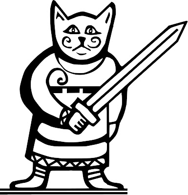
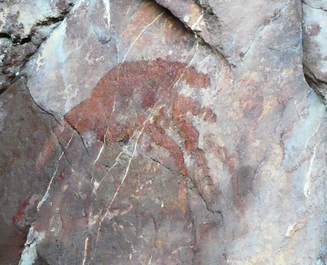
A few days of essential family business later, and I was able to return to the question of space and placement of visual components in the text over the weekend. I've now inked up and digitized all of the original sketches and visual ideas I had for possible wood and stone carvings. Below are a few of them, some turned into border and banner designs, making nearly 20 in all (including cleaned-up versions of the designs used in the stone carvings).
What's quite nteresting is the lack of several notable characters or character-types - no humans are depicted (apart from Gerthild, who is a bit of a special case). This might have been simply due to my interest in figuring out, and representing, the unfamiliar - i.e., the genuine Others - who appear in the story: most readers could visualise what a wizard or a king might look like, but nobody has ever seen, until now, a depiction of a Rockcat or Ulfish person. Only 4 of the 6 (prime) deities have (so far) been drawn, although they are all symbolically represented in the Runic character-set.
Now to figure out where to place them in the text - acting as 'anti-illustrations', as their purpose is not to illustrate the text but rather to create visual harmony (or dissonance?) with the physical layout of the blocks of text, going beyond the realm of decoration, and may (or may not) balance, contradict or subvert the text, its tone and purpose. Like the appearance of the passive Gifli character right before the climactic battle, these placings will need to be carefuly thought out - I'm already happy with the placing of the serpent character as the first and last visual elements, and a few of the others discussed previously. With my next tutorial due on the 8th, that gives me a few days to sort out a final version ahead of getting the whole thing sent to the printers.


Comments
Post a Comment