Posts

Showing posts from 2021

The Valkyrie-Diptych Narrative Framework of the 'Saga'

 In a work that is devoted to deconstruction , it seems ironic to be writing of a structuralist underpinning to one significant part of the Saga , but it is a framework so obscure that it needs some elucidation, and was written into the narrative as a direct reference to Old Norse and Old English scholarship itself. I came across the theory of the “Valkyrie-diptych narrative structure” in the 2013 paper on the alleged presence of Valkyrie-figures in Old English literature , by Philip A. Purser, which I studied at length last summer and which influenced greatly the writing of the early form of the Saga at that time. Whilst I later took much issue with Purser's interpretations , I was intrigued enough by this narrative framework that it's worth quoting Purser's paper in full:           "In 1984, Helen Damico forwards the notion that a type of narrative structure, which gained great currency in twelfth- and thirteenth-century Icelandic and Scandinavian literature, was re

Fragments and Intermediaries, Curating Discourse

Image
 Yesterday, I collected the 5 copies of the printed, bound Gyldlandsaga books from the printers and examined them...it's always nerve-wracking to open up that first copy and peer inside at how it's turned out. But the books look very fine - they have good, solid (even monumental) weight and physicality, and the steel spine adds excellent durability. The lack of "real book" textualities such as copyright bibliographical data, page numbering, ISBN etc., I think, help to enforce the 'art object' aspect of them and take away the 'mass production' aspects of cataloguing and data storage: as far as the international records are concerned, this book does not exist as such (cf Hannah Arendt's idea of refugees with no identity papers etc. being classed as 'non-people by 'the authorities' - i.e those whose rules constitute being or non-being). All the Old English texts on which this is based exist only in unique manuscripts, allowing these very

Furnishing the Display Space

Image
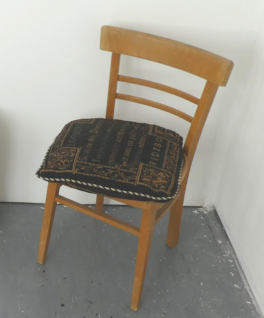
 With the editing/spellchecking of the text now almost complete and due to be sent to the printers at the end of the weekend (after the final round of edits and fine-tuning), biggest concerns have recently been turning to the display space. I've added a chair and cushion to invite a viewer experience of the book - the narrative text. The cushion, with its poetic Latin inscription, is revealed to be a sarcastic mirror of the poetic content of the book. The nature of the Latin text is actually pretty significant, as this blog post and translation shows. The idea that it is itself a 'deconstructed' (cut up/rearranged/repackaged) text about poetry and writing poetry is another layer of playfulness and rebuilding in this museum space, which is more like a space that looks a bit like a museum space - like the Latin text which looks like a Latin text but isn't really (it's corrupt, edited and faulty). In another sense, the Latin may be as obscure as some of the names and

Curating the Exhibition

Image
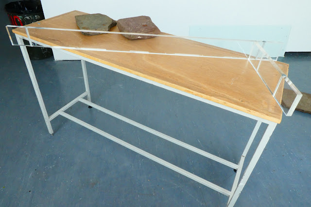
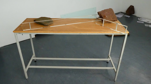
 Monday's curatorial session went well, with new ideas developing from the first, and seeking ways to successfully deconstruct the 'museum' concept - whilst still keeping the recognisable trappings of what constitutes a 'museum' present. I experimented with the display case, which has been completely dis-assembled. I decided to use it as the means of 'shepherding' the audience  around the display, in an anti-clockwise spiral which is perhaps counter-intuitive - as is the placement of the 'big' (i.e formal, clean, detailed and therefore - by general museum curatorial standards - more 'important') stone at the end of this journey. The first stones the visitor would encounter in this set-up are the cruder, less-skilled engravings; the memorial stone and the 'votive' offering stone, currently at the front of the show.  The glass top of the case was a bit of a problem - but, leant against a corner (itself a 'marginalised' space), i

A Return to Orality: Reciting the 'Saga', #1

Image
 Recent tutorial discussions having inspired me to try reciting - performing - some of the Saga , earlier tonight I gave it a go. Four passages, of varying length and dramatic import, were tested out, to see how they might be presented in a live, public-facing environment.  So here follows a short reading of the 'Song of Haeleth of the Dawn's Light', which I think is my favourite 'poem-within-the-poem' if only for its deeply sincere elegaic tone, and the fact it was inspired by a Celtic, rather than Germanic, source - in which an elegy is sung for a brave swordswoman of the Ylfu people, Haeleth. Her vengeful sister, Gwearyffeth, has more than a hint of Gwalchmai (the Welsh prototype of Sir Gawain) about her. Inspired by the 12th Century Welsh bardic song 'The Killing of Hywel ab Owein' (Peryf ap Cedifor, 1170): And now for the beginning of the whole thing...   In classic Old English formulaic fashion, the story begins not with the central character

Summarising the 'Gyldlandsaga' So Far...

Image
In putting together the narration for a 'work in progres' disscussion of the project for tomorrow, I realised this made a decent summary of the project to date, including some new thoughts and research. So here goes:    And here is the text of the presentation (with a few extra explanatory points): This project explores the relationship between word, image, object, and idea, and the representation of a non-existent place and time in a very specific space of bounded, physical place/time. Deconstruction has become the theme of this project, via growing reference to the ideas of Derrida and Foucault, as well as a breakdown of binary oppositions, upon which much structuralist theory is founded -  as well as certain social, cultural and political restrictions which persist today. Originally influenced by the mythological research of levi-Strauss, it was created as a fictional myth system – a body of knowledge concerning gods, their origins, and tales – and their representations – bo

Space and Placement: 2

Image
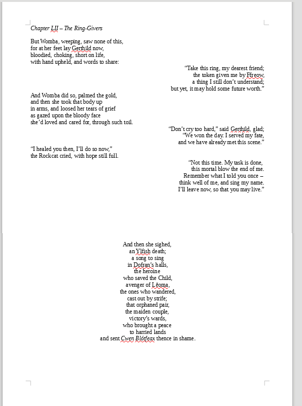
Looking back over some of the modernist poetry we studied in Semester 1's Humanities class, I've continued to apply more radical visual structures to the poetic text, using words and their placement as a means of enforcing certain feelings or concepts for the reader: for example, during an earlier scene where the main character struggles up the rocky path to her home at a pivotal moment, separating each word describing the journey onto a line, spaced out from the previous, and following, words to suggest a tricky series of steps (compounds and phrases such as 'rock-tripped', 'thorn-pricked', 'branch-beaten' enforcing the difficulty of the climb). And, in the climactic battle - the main emotional thrust of which is not the overall victory of the allies, or the defeat of the tyrant king and queen - but the loss of the main character's best friend, the effect of which reaches its pinnacle in the third page below, signifying almost unbearable isolation a

Of Print and Publicity

Image
Whilst editing of the text continues (the early chapters, having been derived from a long-abandoned prose work, need special amounts of attention), I also spent some time editing some of the design pieces for submission to the Masters showcase for this year. I doubt very much any of them will be accepted, but they will come in handy for the online degree show, which will be a very different form of presentation to the physical space:  I also decided to check with the art school print shop their options for binding hardback books - the 'thesis' style which I initially deemed "not quite what I'm looking for" some months ago, but which now seems wholly appropriate - being the traditional form of binding for academic, authoritative texts, an assumed status which is offset by the interior text in all its ambiguity and ambivalence. The print team also offered a choice of gold or silver lettering/design for the covers, which I found very interesting. I've never liked

The Spaces Between...Looking Into the Void

Image
 Additional: After posting the above designs, I decided to play around with inverting and multiplying them in Photoshop and investigating the abstract spaces which opened up between the repeated images: This led into a mini-exploration of the Japanese concept of Ma (negative, empty space or void - a concept which I had explored previously in my 2020 Honours degree work) and created a few abstract forms as a result:   Some of these are still recognisable from their original forms - some are rather Rorschach-like. I'm not quite sure what use these might be to the overall exhibition or the book design, although it seemed to chime faintly with Derrida's deconstruction of binary oppositions (black/white, say) and therefore seemed to be a physical and literal 'bit between' those boundaries and extremes (black outlines creating forms on white paper) amd therefore somewhat linked to the notion that characters, races and nations in the text are not 'black and white' -

Creating Visual (Dis?)Harmony

Image
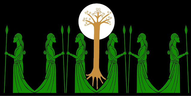
 A few days of essential family business later, and I was able to return to the question of space and placement of visual components in the text over the weekend. I've now inked up and digitized all of the original sketches and visual ideas I had for possible wood and stone carvings. Below are a few of them, some turned into border and banner designs, making nearly 20 in all (including cleaned-up versions of the designs used in the stone carvings).  What's quite nteresting is the lack of several notable characters or character-types - no humans are depicted (apart from Gerthild, who is a bit of a special case). This might have been simply due to my interest in figuring out, and representing, the unfamiliar - i.e., the genuine Others - who appear in the story: most readers could visualise what a wizard or a king might look like, but nobody has ever seen, until now, a depiction of a Rockcat or Ulfish person. Only 4 of the 6 (prime) deities have (so far) been drawn, although the

Space and Placement

Image
 Today's tutorial went well, focusing mainly on space - both physical and visual, in the 'museum'/exhibition layout, and in the text itself, which is now in the final editing and presentation stage. We discussed the nature of traditional museums and how they tend to put the visitor through a planned timeline of experience - navigating different places and spaces - circular and/or linear. This came back to my sketchy idea of enforcing some kind of cyclical physicality upon the visitor to my space - bringing them back to the beginning (cf. the ouroborus snake design, again). Seeing strong examples of what can be done with art books and layout had influenced my thoughts on using more white space in the book/text (and reflecting this in the physical museum layout) - by adding blank pages, or creating extra spaces between lines and words at crucial points in the narrative, and interpolating the drawings of characters not as illustrations but as 'break points', for exampl

Around and Around...

Image
 The ouroboros - an ancient symbol of fertility, totality, eternity, being a serpent or dragon chewing its own tail. The design below is a 'cleaned up rough' of the first visualization I created for this project, last autumn, and grew out of a sketchbook scribble originally planned to be a collaboration with a metalworking student, aimed at producing a brooch or similar piece of physical jewelry design: With its horn or antler, the design also echoes the hybrid beasts of Celtic/Pictish design, and my own 'cosmic beast' which is supposed to embody attributes of all animals, being the progenitor of all species. The design is also intended to look in two directions at once, in something of an Escher-like visual paradox - the tail curving around in one plane to be held in the mouth, but also suggestive of moving away from the viewer and ending up behind the snake's head, hinted at by the distortion applied to the bodily decorations, and the fact the inner space is not

Deconstructing the Museum: Part 1

Image
 A most excellent curatorial tutorial today pulled things in a totally unexpected - but possibly inevitible - direction, given the themes of deconstruction, subversion and metatextuality which have been at the forefront of things lately. It all started when we dismantled the glass display case to get some stones inside...and then we started moving things around... Currently it's all about utilising the space, and subverting the expectations of what a traditional museum ought to look like, even down to whether the explanatory texts ought to be placed alongside their corresponding exhibits - and in a sense also echoing early 20th Century criticism of Beowulf  (which Tolkien confronts in his famous essay The Monsters & the Critics ) that the 'marginal elements' (i.e the monster fights and the dragon) are given centre-stage (because, obviously, any 'serious' epic must not trouble the reader with such trivia - despite the plethora of sea-monsters, one-eyed giants and